Typography in video games
2026-10-27 · 18 min read
A player reading an inventory description can pause and inspect a sentence. A player checking ammunition during combat has to extract a number while looking elsewhere. Both encounters involve text, but they impose different demands on its shape, position, and persistence. A typeface chosen from a large, static specimen has answered only a small part of the design problem.
Current accessibility guidance treats text as a configurable system. Microsoft's Xbox Accessibility Guidelines specify rendered size, scaling, font alternatives, and language coverage. A recent implementation report makes the connection to layout concrete: on October 23, 2026, developer Cobo Sawyer described how Mytheria enlarges its interface to 150%, rearranges screens, and offers darker backgrounds behind text. These are documented design provisions; the report does not establish an improvement in reading speed or error rates [1], [2].
This masterclass develops that system through actual font specimens and original interface demonstrations. The source review closes on October 27, 2026. The figures use real OpenType glyph outlines, shaped with HarfBuzz and exported to SVG. They are fixed illustrations, with their text repeated in captions and the discussion. They should be inspected at full size where needed; browser scaling changes their apparent size. No figure is a player study, an engine benchmark, or a screenshot from a shipped game.
Read the letterforms before choosing the theme
A typeface is a family of designed letterforms. A font is a particular usable implementation of that design, such as a regular font file or a variable font containing a range of weights. A glyph is a drawable shape: several glyphs can represent the same character depending on context. These distinctions become useful when the same family supplies a title, a subtitle, and a changing counter.
Start a specimen with characters that are easy to confuse. I, l, and 1 test the distinction between capital I, lowercase L, and the numeral one. O and 0 test a letter against a number. rn and m expose whether adjacent shapes merge perceptually at small sizes. Add punctuation, decimal separators, and the words the game actually uses. A password field, a multiplayer name, and an ammunition counter each reveal a different weakness.
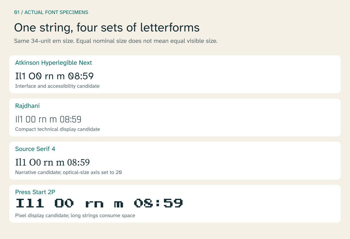
Figure 1. Actual font specimens at a shared 34-unit em size. Atkinson Hyperlegible Next is instantiated at weight 400; Source Serif 4 at weight 400 and optical size 20. Rajdhani and Press Start 2P use their regular files. Openly licensed fonts from their authors, distributed through Google Fonts; original EFFOMA specimen layout. Equal em sizes do not establish equal visible body heights. Open full-size specimen.
The em is the font's design unit scaled to the requested size. The x-height is the height of a lowercase letter such as x. The counter is the enclosed or partially enclosed space inside a letter. A generous x-height can make lowercase words appear larger, while sufficiently open counters help preserve distinctions when text is reduced. Neither property guarantees that a player will read a particular interface successfully.
The four families provide different starting materials. Braille Institute introduced Atkinson Hyperlegible Next in February 2025 to expand its low-vision-oriented family, with seven weights and support for more than 150 languages. That design intention makes it a useful accessibility candidate, while the game's own evaluation still has to establish suitability [3]. Rajdhani, by Satya Rajpurohit and Jyotish Sonowal, supplies compact, squared letterforms. Source Serif 4, by Frank Grießhammer and collaborators, includes optical sizes, which adapt letter construction for different reading sizes. Press Start 2P, by CodeMan38, supplies a deliberately pixelated display vocabulary [4]–[6].
In the specimen, Rajdhani's narrow shapes leave more horizontal space; Press Start 2P consumes considerably more. That observation concerns these strings and font instances. Before treating compactness as an advantage, repeat the comparison at the game's final output size. A narrow letter that fits a button but loses a distinguishing stroke has traded away useful information.
Assign typography to the player's task
A coherent game can use more than one reading voice. Identity can reside in chapter titles, faction names, and a few repeated visual motifs. Instructions and descriptions can use a quieter face while preserving the game's palette, panel geometry, and spacing.
The useful distinction is between recognition and sustained reading. A short, familiar label may be recognized as a unit. A newly encountered item description requires the player to follow words and sentences. The same decorative treatment has different consequences in those two conditions.
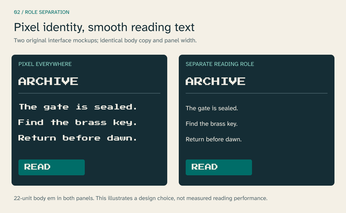
Figure 2. An original mockup separates display identity from body copy. Both panels have the same width and 22-unit body em size. Press Start 2P remains in the title and button; the right panel uses Atkinson Hyperlegible Next for the description. This comparison illustrates the role assignment, without claiming a measured performance advantage. Open full-size comparison.
The right panel suggests a practical arrangement for a pixel-art game: pixel typography in a few short, prominent places, and smooth text for longer passages. A player-selectable plain-text mode can extend that arrangement to every functional label. Microsoft's guidance specifically calls for a non-stylized alternative when stylistic fonts are used [1].
Choose roles before specifying sizes. This keeps hierarchy tied to information rather than to a list of arbitrary font values.
| Reading role | What must remain apparent | A useful failure to test |
|---|---|---|
| Chapter or location title | Place, identity, transition | The title occupies the subtitle region |
| Objective | Required action and target | Flavor text obscures the action |
| Inventory description | Meaning across several sentences | Enlarged text clips or requires two-axis scrolling |
| HUD counter | Value, unit, state change | Changing digits move neighboring elements |
| Subtitle or caption | Speech, speaker, meaningful sound | Text disappears against the scene |
| Control prompt | Current input and its action | A remapped key or icon no longer fits |
In an objective, typographic hierarchy can follow the grammar: “Open the eastern gate” carries the action; the quest name supplies context. Giving both equal weight makes the player perform the prioritization. A single increase in weight or separation can make the relationship explicit without introducing another font family.
Use kerning, the adjustment of particular letter pairs, to preserve the font's intended spacing. Treat tracking, a general spacing adjustment across a run of text, more cautiously. Increasing it may help a short uppercase label, but applying the same amount to every paragraph changes word shapes and line breaks. Decide from the reading task and test the result.
Measure the output that the player sees
The engine's font-size field is an input to rendering. The visible body height depends on the font's metrics and the transformations applied afterward. Compare the smallest essential strings in final screenshots, including descenders such as g and y.
At 1080p, XAG 101 recommends a minimum rendered body height of 26 pixels for console text and 18 pixels for PC/VR text, with corresponding values of 52 and 36 pixels at 4K. It also recommends scaling to 200% of the minimum without losing content or functionality. These are platform-context recommendations measured from the rendered body, rather than interchangeable CSS sizes or universal angular-size thresholds [1].
For a console menu, inspect text at the intended television distance. For a handheld, inspect the physical device. For world-space VR text, record distance and angular size as well as the rendered image: moving the same panel farther away changes the reading condition even if its texture stays identical.
Enlargement must have somewhere to go. Permit descriptions to become taller, lists to scroll vertically, and controls to move into another row. Preserve the selected item when the layout changes. Avoid silently shrinking the font until a fixed rectangle fits; that can cancel the very setting the player selected.
Mytheria's October report describes this connection between scaling and rearrangement, alongside immediate previews of accessibility changes [2]. A 150% implementation is useful evidence of the approach, but it is a different limit from XAG's 200% recommendation. The reported implementation should not be described as establishing compliance with the whole guideline.
Keep HUD numbers stable
Many fonts contain both proportional figures, whose advance widths differ, and tabular figures, whose advance widths are equal. The advance is the distance the layout system moves before placing the next glyph. Equal numeral advances help a counter keep its occupied width when the number of digits stays constant.
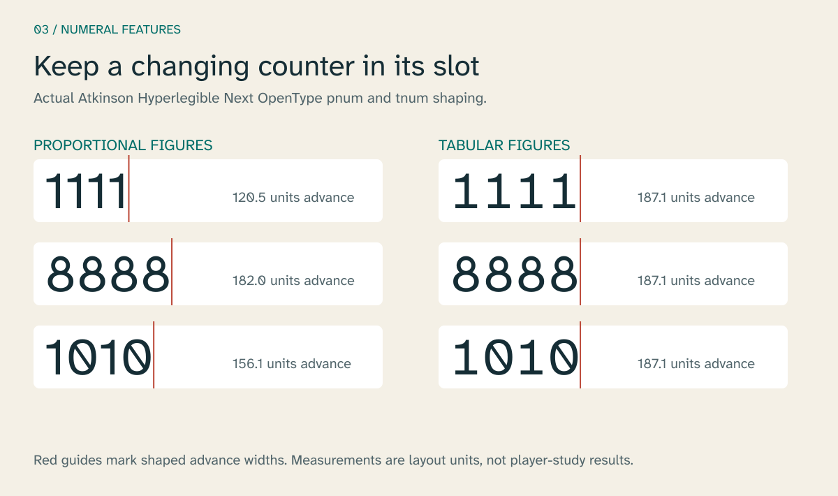
Figure 3. Actual OpenType pnum and tnum features in Atkinson Hyperlegible Next, shaped at a 74-unit em size. Red guides mark total advances rather than outer ink bounds. The generator verifies that these four-digit strings have equal advances with tnum; exact values are retained in the figure manifest. This is a layout measurement. Open full-size comparison.
Tabular numerals do not make a whole timer monospaced. Colons, decimal points, signs, and unit labels may still have their own widths. A transition from 999 to 1,000 also introduces characters. Give the counter a reserved slot, align it deliberately, and test the maximum formatted value.
Proportional figures can remain appropriate in prose. The decision belongs to the text run: a clock or score field can request tnum while a description uses the default figures. The OpenType feature must survive the engine's shaping and font-asset path. Do not assume that a feature visible in a design tool will appear in a baked atlas.
A useful counter specimen includes 00:00, 11:11, 88:88, a negative value, and the largest expected number. Check locale formatting at the same time. A decimal comma or a differently grouped score changes the string that the layout must accommodate.
Compose subtitles against a changing scene
A subtitle conveys speech. A caption can also convey a meaningful sound, speaker information, or a source outside the camera view. A game that captions dialogue but omits an offscreen warning sound may leave essential information unavailable.
XAG 104 recommends mixed-case text, speaker identification where needed, a sans-serif option, configurable backgrounds, and meaningful caption coverage. It advises avoiding long lines, generally presenting no more than two subtitle lines, and making line breaks editorially sensible [7]. The typography has to work with timing and placement as well as with those visual provisions.
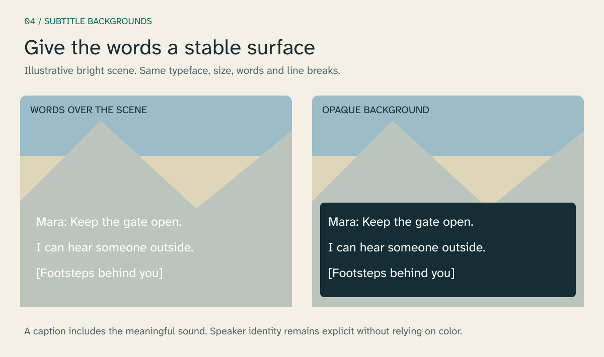
Figure 4. Original subtitle and caption mockups using Atkinson Hyperlegible Next. Both display “Mara: Keep the gate open. I can hear someone outside.” and “Footsteps behind you]”. The opaque panel gives the words a stable background. The landscape is schematic; no commercial game footage or contrast benchmark is represented. [Open full-size comparison.
An outline can separate a letter from nearby scenery, but a thick outline also changes the apparent stroke and can close small counters. Start with a sufficiently large reading size and a configurable background, then assess whether an outline adds useful separation. Preview the treatment against a bright sky, dark interior, foliage, and visual effects.
XAG 102 specifies at least 4.5:1 contrast for standard-size important text and 3:1 for large text, using its own rendered-size definitions. For a varying background, it calls for measurement against the lowest-contrast area. A ratio taken from the average scene color does not establish that every word remains visible [8].
Timing creates another constraint. A line that fits spatially can still vanish before the player has read it while navigating. Break dialogue at meaningful boundaries, preserve the distinction between speech and sound descriptions, and inspect overlaps with prompts and objectives. A speaker label should remain useful when color is unavailable. Decide caption wording with the game's audio and narrative teams: an unidentified sound should not accidentally reveal a concealed character's identity.
Treat localization as a change to the layout system
A font containing every character in a translation is necessary, but character coverage alone cannot establish correct text. Shaping determines which glyphs appear and where they go. HarfBuzz describes that conversion as producing glyph identifiers and positions from an input text buffer [9].
Arabic requires contextual forms and appropriate bidirectional handling. Thai brings combining marks and language-specific line breaking. Chinese, Japanese, and Korean introduce a much larger glyph inventory. Vietnamese provides an especially clear Latin-script test: a base vowel can carry both a vowel mark and a tone mark.
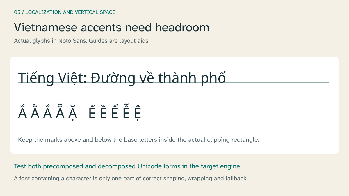
Figure 5. Actual Noto Sans glyphs for “Tiếng Việt: Đường về thành phố” and accented vowels, instantiated at weight 400 and width 100. The specimen generator checks both precomposed and decomposed Unicode forms for missing shaped glyphs. Baseline guides illustrate the need for vertical clearance; this does not validate a game's clipping or line-breaking behavior. Google Fonts distributes the openly licensed font 10]. [Open full-size specimen.
This demonstration exposed a concrete coverage problem. The downloaded Atkinson Hyperlegible Next version 2.001 produced missing glyphs in this Vietnamese sentence after shaping. The figure therefore uses Noto Sans, whose downloaded instance passed the same check. A headline language count did not settle whether the characters in this particular string were available. The local manifest records the font-file hashes and the missing-glyph clusters so the observation remains tied to the files actually tested.
Precomposed Unicode can encode an accented letter as one code point. A decomposed sequence can encode the base and combining marks separately. Test both forms through the actual content pipeline. A string may be intact in the translation file yet lose a mark when it is sliced, truncated, or assigned an undersized clipping rectangle.
Fallback fonts supply shapes absent from the primary font. They also introduce another set of proportions, weights, and vertical metrics. Unity's TextMeshPro documentation describes searches through fallback font assets; Unreal Engine's font editor supports composite fonts with subfamilies [11], [12]. Use those mechanisms deliberately, with script-appropriate families and explicit review of mixed-script lines.
Translate the specimen itself. Include the longest real inventory names, punctuation conventions, user names, and key prompts. Ask native readers to inspect wrapping and emphasis. Artificially expanded English is useful for finding rigid containers, but it cannot test another language's shaping, phrasing, or reading direction.
Preserve the letterform through rasterization
Once text has been shaped and laid out, the engine must turn its glyphs into visible pixels. A font atlas packs glyph images into a texture. Raster atlases can work well at their intended size; scaling them substantially exposes the resolution of the stored image.
A signed distance field, or SDF, stores distance information around an edge rather than only its coverage. The renderer reconstructs the edge from that field. Chris Green's 2007 work at Valve described this approach for magnifying vector-like textures and glyphs; it is a foundational rendering method rather than an October 2026 invention [13]. Unity documents SDF font assets as a way to retain smooth text through transformations [11].
Single-channel distance fields can lose sharp corner detail. Viktor Chlumský's MSDF generator uses multiple channels to represent edges and reconstruct corners more faithfully. Its documentation also makes implementation conditions explicit, including treating distance-field channels as linear data and setting an adequate distance range [14].
These methods preserve different aspects of the source. They still need sufficient atlas resolution, padding, and a suitable shader. Test small text as well as large titles, especially thin strokes, stacked accents, and outlines. Inspect the final composited image: a crisp font atlas does not establish crisp output after temporal processing, scaling, or streaming.
Pixel fonts need a separate decision. If the intended aesthetic is a strict grid, use a raster treatment at its designed scale or appropriate integer multiples, with deliberate placement and filtering. A smooth outline specimen of Press Start 2P shows the font's construction; it does not reproduce an engine's pixel-perfect sampling.
Dynamic glyph caches introduce a further test case. A language that was absent during startup can require new glyphs later. Profile first-use behavior and memory with representative text, including chat and player names, rather than only the opening menu. No atlas strategy should be called the fastest without measurements from the target implementation.
License the use that will ship
A commercial font can be the right choice when its design, language coverage, or support meets a project's needs. Obtain the permission for the intended distribution, including the way fonts enter the game build. A downloadable specimen or a design-tool subscription should not be treated as evidence of that permission.
Monotype's current game-licensing explanation describes a specific limit worth distinguishing from a universal rule. Its updated Japanese LETS Game Option covers up to 10,000 distributions per title per year, with other licensing paths for broader use. That threshold belongs to the named offering; it is not a limit on all Monotype fonts, all foundries, or all games [15].
The demonstrations here use fonts under the SIL Open Font License. Its FAQ permits graphic creation from font outlines and describes the conditions for bundling font software, including retaining the relevant license and copyright information [16]. The figures are fixed artwork; the article does not distribute an installable font. Font versions, download locations, hashes, and specimen settings are retained in the local provenance record.
There is no paid-font purchase behind these examples. A specimen API would still need to render the named font accurately and permit the intended use. Generating an image of approximately similar lettering would weaken a typography demonstration because the resulting shapes could no longer be inspected as the actual typeface.
Evaluate the smallest essential reading task
A useful evaluation starts with a task the player must complete: identify the selected inventory item, find the objective, distinguish ammunition from reserve ammunition, or follow a caption while moving. Keep the wording and surrounding interface fixed when comparing font treatments, and document the screen, viewing distance, rendering mode, language, and accessibility settings.
Measure completion, errors, and reading or response time where those measures fit the task. Collect comfort and preference separately. A player can prefer a treatment while making more errors with it; another can need an option that an average score conceals. Include readers with low vision and relevant language expertise rather than treating an enlarged screenshot as their proxy.
The worked figures isolate useful properties: letter construction, role assignment, numeral advances, background stability, and accent clearance. A shipping game combines them with motion, time pressure, input, and changing content. The remaining design problem is to preserve its visual identity while allowing that complete reading system to adapt to the player. That requires testing the same essential task across the conditions in which the words will actually be used.
References
[1] Microsoft, “Xbox Accessibility Guideline 101: Text display,” Microsoft Learn, Mar. 4, 2026. Accessed: Oct. 27, 2026. [Online]. Available: https://learn.microsoft.com/en-us/xbox/accessibility/xbox-accessibility-guidelines/101
[2] C. Sawyer, “Accessibility settings in games: every option we built and why,” Cobo Makes Games, Oct. 23, 2026. Accessed: Oct. 27, 2026. [Online]. Available: https://cobomakesgames.com/blog/accessibility-settings-in-games/
[3] Braille Institute, “Braille Institute launches enhanced Atkinson Hyperlegible font to make reading easier,” Feb. 10, 2025. Accessed: Oct. 27, 2026. [Online]. Available: https://www.brailleinstitute.org/about-us/news/braille-institute-launches-enhanced-atkinson-hyperlegible-font-to-make-reading-easier/
[4] S. Rajpurohit and J. Sonowal, “Rajdhani,” font files and metadata, Google Fonts repository. Accessed: Oct. 27, 2026. [Online]. Available: https://github.com/google/fonts/tree/main/ofl/rajdhani
[5] Adobe, “Source Serif,” source code and design information, GitHub. Accessed: Oct. 27, 2026. [Online]. Available: https://github.com/adobe-fonts/source-serif
[6] CodeMan38, “Press Start 2P,” font files and metadata, Google Fonts repository. Accessed: Oct. 27, 2026. [Online]. Available: https://github.com/google/fonts/tree/main/ofl/pressstart2p
[7] Microsoft, “Xbox Accessibility Guideline 104: Subtitles and captions,” Microsoft Learn, Mar. 4, 2026. Accessed: Oct. 27, 2026. [Online]. Available: https://learn.microsoft.com/en-us/xbox/accessibility/xbox-accessibility-guidelines/104
[8] Microsoft, “Xbox Accessibility Guideline 102: Contrast,” Microsoft Learn, Mar. 4, 2026. Accessed: Oct. 27, 2026. [Online]. Available: https://learn.microsoft.com/en-us/xbox/accessibility/xbox-accessibility-guidelines/102
[9] HarfBuzz contributors, “Shaping and shape plans,” HarfBuzz documentation. Accessed: Oct. 27, 2026. [Online]. Available: https://harfbuzz.github.io/shaping-and-shape-plans.html
[10] Noto contributors, "Noto Sans," font files and metadata, Google Fonts repository. Accessed: Oct. 27, 2026. [Online]. Available: https://github.com/google/fonts/tree/main/ofl/notosans
[11] Unity Technologies, “Font Assets,” “About SDF fonts,” and “Fallback font assets,” TextMeshPro documentation, ver. 4.0.0-pre.2. Accessed: Oct. 27, 2026. [Online]. Available: https://docs.unity.cn/Packages/[email protected]/manual/FontAssets.html ; https://docs.unity.cn/Packages/[email protected]/manual/FontAssetsSDF.html ; https://docs.unity.cn/Packages/[email protected]/manual/FontAssetsFallback.html
[12] Epic Games, “Font Asset and Editor,” Unreal Engine documentation. Accessed: Oct. 27, 2026. [Online]. Available: https://dev.epicgames.com/documentation/en-us/unreal-engine/font-asset-and-editor-in-unreal-engine
[13] C. Green, “Improved alpha-tested magnification for vector textures and special effects,” in ACM SIGGRAPH 2007 Courses, 2007, pp. 9–18, doi: 10.1145/1281500.1281665. Accessed: Oct. 27, 2026. [Online]. Available: https://cdn.akamai.steamstatic.com/apps/valve/2007/SIGGRAPH2007_AlphaTestedMagnification.pdf
[14] V. Chlumský, “Multi-channel signed distance field generator,” msdfgen, source code and documentation. Accessed: Oct. 27, 2026. [Online]. Available: https://github.com/Chlumsky/msdfgen
[15] P. Carey-Bergren, “Understanding game licensing at Monotype,” Monotype. Accessed: Oct. 27, 2026. [Online]. Available: https://www.monotype.com/resources/expertise/understanding-game-licensing-monotype
[16] SIL International, “OFL-FAQ,” ver. 1.1-update7, Nov. 2023. Accessed: Oct. 27, 2026. [Online]. Available: https://openfontlicense.org/ofl-faq/